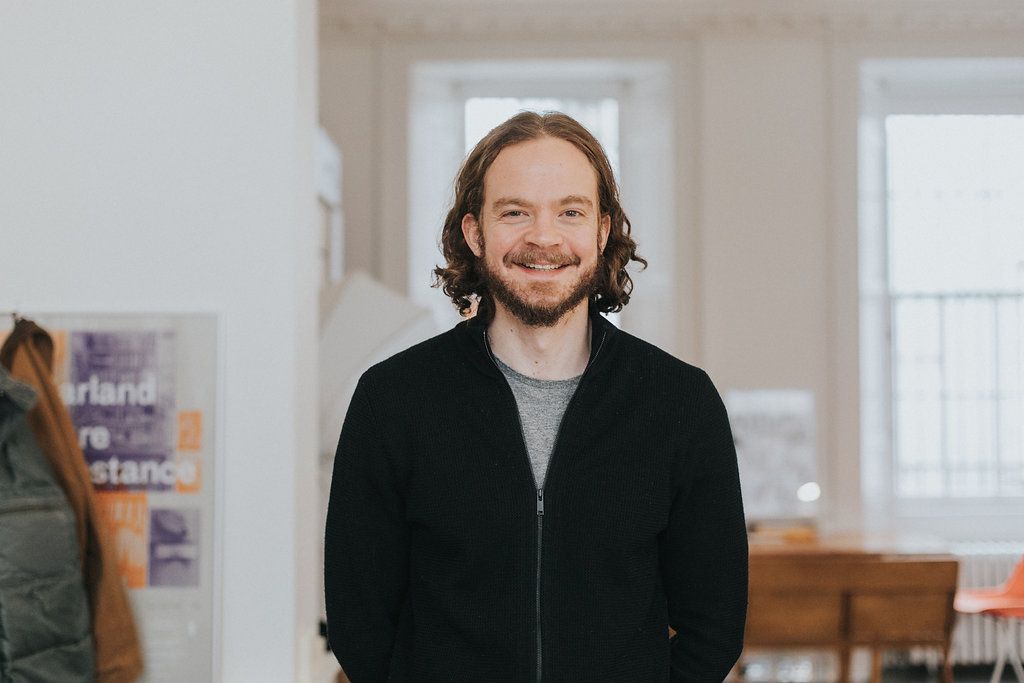
Ryan discusses typography, the new app design, and having multiple creative outlets

By Dana Jaffe
Recently, our editor Dana Jaffe sat down with each of the buddhify team members to find out what they’re all about. Here she talks with Ryan Thompson about the most-loved design element of buddhify, his creative process for rebranding, and his go-to meditation category.
The fundamental, most memorable, and engaging part of buddhify is, without doubt, the wheel. This is what makes the app work and it’s the cornerstone of the user interface. It’s attractive, it’s friendly, it’s smooth, it’s confident and it’s… colourful.
When it came to developing the visual identity and helping re-position buddhify, the starting point was provided by the first question I always like to ask myself when confronted with an established brand which needs to find the next steps in its evolution. Essentially, that is: “What do we have within the existing visual assets which really encapsulates what this brand is all about?” And: “How best can we utilise this asset, or assets.” Basically, it takes the form of a sort of soft audit, a discussion, about what’s worth keeping, and what can be taken away.
It’s obvious that there was one simple, invaluable, starting point sitting right under our noses: the wheel. So, straight away we have identified a basis to build a new foundation for a cohesive, rationalised graphic identity, using an incredibly inviting colour palette which users already know and love.
Once we have the basic visual principles and characteristics in place, the next thing we look at is the emotional, or human, side of the brand. How do we get that from these seemingly mechanical elements? The principle of movement, of flexibility and fluidity, sets us on our way… but what else do we need to think about? What else is this product — and the overall brand — about? With buddhify, it’s playful. It’s about interplay, it’s about overlaps and layers of content. It’s about having fun, while also finding direction, assurance, and positivity. It isn’t reliant on fads, superfluous styling, or gimmick. It’s relevant right now, but we also want it to be timeless.
We explored examples of lettering and typography going back to the early-to-mid Twentieth Century, and the Bauhaus in particular. This nod to the past — to one of the most influential eras in architecture and design — helped to provide the sense of classic-meets-modern which is so important to buddhify. The progression towards a strong, bold, new wordmark, created from simple geometric shapes, came intuitively. It felt right.
Once this direction was established, working through variations of the wordmark (solid, transparent with overlays, full colour, monochrome), extracting the signature ‘B’ to apply to a new icon, and so forth, provided a new suite of assets that are ‘fixed’ enough to achieve recognition through consistency, while also creating a usable identity system that reflects the principles of movement, fluidity, and flexibility.
Music has always been a huge part of my life and when I’m not busy with the ‘day job’, I’m pretty much doing something music-related. Whether that’s simply a case of checking out new music or listening to some old favourites while I’m making dinner.
My design work is fairly process-driven and pragmatic, with the focus always being on the brief and doing whatever is best to serve any given client or project. By contrast, the time I spend playing and writing music with the band is a creative outlet which is much more about self-expression. Having another creative outlet which requires a totally different way of thinking and doing is something that I really value and enjoy. Aside from anything else, it’s noisy and it’s fun. That’s the main thing!
I know the app fairly well through my years of working with Rohan and the rest of the team. I’m a dabbler rather than a regular user though. The sleep meditations are my ‘go to’ as I need some help switching my brain off at night sometimes.
Generally speaking, I don’t have a pronounced interest in mindfulness and meditation, but I do find it incredibly fascinating and definitely value the application of mindfulness principles in everyday life. Anything that can help people feel more confident, more at ease, less stressed, or less anxious is good in my book — whether that be meditation, playing music, painting a picture, or going to a kickboxing class.
Ryan is a long-time friend of the buddhify team and when we were looking to refresh the app’s visual identity and colour palette, Ryan was the only person we would ever ask. A deeply talented and experienced graphic designer, he has a specialism in typography and design with a timeless quality.
You can learn more about Ryan and his work at www.rydo.co.uk.